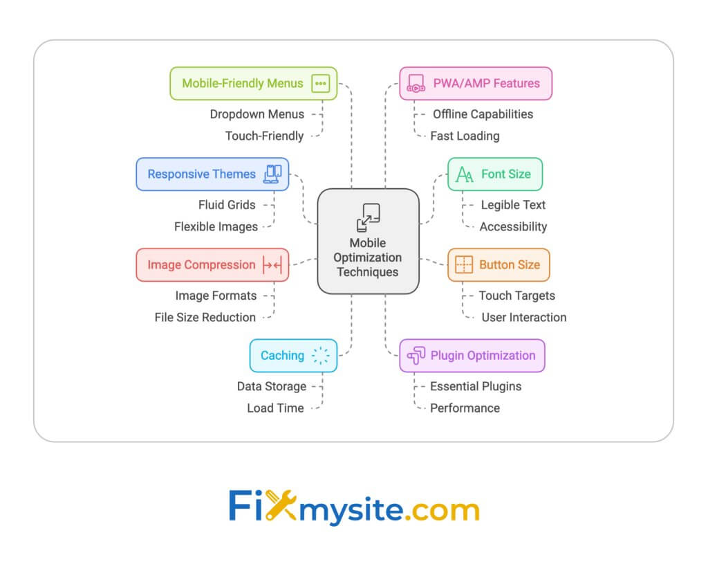
Here’s a quick guide to optimizing your WordPress site for mobile:
- Use responsive themes
- Increase font size (minimum 16px)
- Make buttons at least 48×48 pixels
- Compress and resize images
- Enable caching
- Optimize plugins
- Implement mobile-friendly menus
- Consider PWA features or AMP
Key steps:
- Test regularly with Google’s Mobile-Friendly Test
- Check Core Web Vitals (LCP, FID, CLS)
- Use real devices for testing
Common issues and fixes:
| Issue | Fix |
| Slow loading | Compress images, enable caching |
| Menu not working | Check for plugin conflicts, update everything |
| Site not mobile-friendly | Use responsive theme, optimize layout |
Remember: Mobile optimization is an ongoing process. Keep testing and adjusting as technology evolves.
How To Optimize WordPress Website For Mobile 2024 (Step-By-Step) Video
Common Mobile Display Problems
Mobile issues can tank your WordPress site’s performance and frustrate users. Let’s look at the biggest problems and how to spot them.
Top Mobile Issues to Fix
- Tiny Text and Buttons: Small text (under 16px) is a pain to read on phones. Tiny, crowded buttons? That’s a recipe for misclicks.
- Horizontal Scrolling: If users have to swipe sideways, you’ve got a problem. It’s a usability nightmare.
- Slow Loading Times: Big, unoptimized images and script overload? Say hello to sluggish load times.
- Menu Mayhem: Complex menus often break on mobile. Users can’t find what they need? They’ll bounce.
- Rigid Layouts: Fixed-width designs don’t play nice with different screen sizes. The result? Display chaos.
Here’s how these issues mess things up:
| Issue | User Experience Hit | SEO Fallout |
| Tiny Text/Buttons | Users get annoyed, leave fast | Engagement nosedives |
| Horizontal Scrolling | Navigation headaches, missed content | Less time on site |
| Slow Loading | Impatience wins, users bail | Bounce rates soar, rankings drop |
| Menu Mess | Info hunt becomes a chore | Fewer page views |
| Rigid Layouts | Content gets cut, readability suffers | Mobile usability score tanks |
Spotting Mobile Problems
You need to catch these issues. Here’s how:
- Google’s Mobile-Friendly Test: Quick, free, and tells you if your site’s mobile-ready.
- Google Search Console: Check the Mobile Usability report. It’ll flag problem pages.
- Browser Dev Tools: Use mobile emulation to see how your site looks on different devices.
- Real Device Testing: Nothing beats checking on actual phones and tablets.
Jake Lett, a B2B Marketing pro, nails it:
“The error it flagged was caused by something I have seen on other sites and the fix is easy to make but also often hard to find.”
When you’re testing, keep an eye on:
- Is the text easy to read?
- Can you tap buttons without zooming?
- Is the viewport set up right?
- Does content fit the screen width?
- Are your plugins playing nice on mobile?
Fix these issues, and you’re on your way to a mobile-friendly site that users (and Google) will love.
How to Test Mobile Performance
Testing your WordPress site on mobile is key. Here’s how to do it right:
Phone Testing vs. Computer Tools
Real phones beat computer tools. Here’s why:
| Testing Method | Pros | Cons |
| Real Devices | – Real user experience – Tests actual touches – Shows real issues |
– Need many devices – Takes time |
| Computer Tools | – Fast and easy – Tests many devices – Often free |
– Might miss real issues – Can’t test real touches |
Tips for Real Device Testing:
- Use Android and iOS
- Test on phones and tablets
- Check on 4G, Wi-Fi, and 3G
This shows why real testing matters. It catches things simulators miss.
Computer Tool Options:
- Google Chrome DevTools: Right-click, “Inspect”, then click the device icon.
- Safari Responsive Design Mode: Go to Develop > Enter Responsive Design Mode.
- Google’s Mobile-Friendly Test: Free tool that checks mobile usability.
Reading Test Results
Got a bunch of data? Here’s what to focus on:
- Core Web Vitals: Google’s key metrics:
- Largest Contentful Paint (LCP): Under 2.5 seconds
- First Input Delay (FID): Less than 100 milliseconds
- Cumulative Layout Shift (CLS): Below 0.1
- Fix Issues in This Order:
- Critical rendering path problems
- Big, unoptimized images
- Blocking JavaScript and CSS
- Compare Mobile vs Desktop: Mobile scores are often lower. For example:
- Desktop: 97-99
- Mobile: 60-70 (max 80)
This gap is normal, but try to close it.
- Use Multiple Tools:
- Google PageSpeed Insights (free)
- GTmetrix (free plan, premium from $14.95/month)
- WebPageTest (free)
- Test Often: Check monthly or after big changes.
The goal? A fast, smooth mobile experience. Always retest after changes.
Basic Mobile Display Fixes
Let’s look at how to fix common mobile display issues in WordPress. These changes will make your site easier to use on phones and tablets.
Screen Size and Text Settings
Small text is a big problem on mobile. Here’s how to fix it:
Make your base font size at least 16 pixels. Use ’em’ or ‘rem’ units for fonts to keep things consistent on different screens. And don’t forget to increase line spacing.
Making Buttons Easy to Tap
Tiny buttons are a pain on mobile. Here’s how to fix them:
Make buttons at least 48×48 pixels on mobile. Add plenty of padding around clickable stuff. And space out your links so people don’t tap the wrong thing.
Mobile Menu and Content Setup
A good mobile menu and well-formatted content are key. Here’s what to do:
Use a hamburger menu or a simpler version of your main menu for mobile. Make sure all images are responsive with max-width: 100%. And use a fluid grid system that adapts to different screen sizes.
Here’s a quick look at the main fixes:
| Problem | Solution | How to Do It |
| Tiny text | Bigger fonts | Use CSS for 16px minimum font size |
| Small buttons | Larger tap targets | Make buttons 48x48px minimum, add padding |
| Wide content | Responsive layout | Use max-width: 100% for images, flexible grids |
| Complex menus | Simpler navigation | Use a mobile-friendly menu (like hamburger) |
These fixes are just the start. Keep testing on different devices to make sure your WordPress site works great on mobile. Mobile optimization is an ongoing process, not a one-time fix!
Making Your Site Load Faster
Slow WordPress sites frustrate mobile users and hurt search rankings. Let’s fix that.
Smaller Images and Videos
Big media files often slow down mobile pages. Here’s how to fix it:
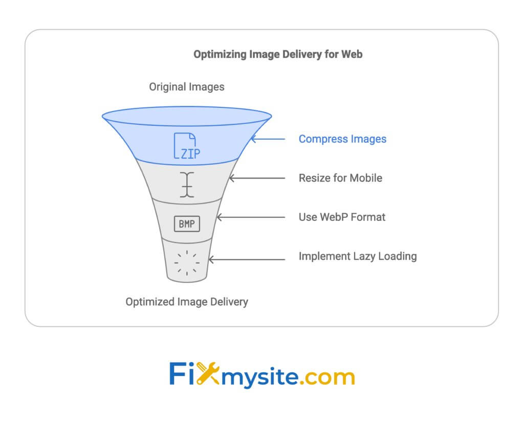
- Compress images: Use TinyPNG or Compress JPEG. You can shrink images by up to 90% without losing quality.
- Resize for mobile: Don’t load huge images on small screens. A 2000px wide image on a 375px wide screen? That’s a no-go.
- Use WebP: These images can be 25-34% smaller than JPEGs or PNGs. Same quality, less space.
- Lazy load: Only load images as users scroll. It’s like serving dinner one course at a time, not all at once.
Here’s a quick look at how these tricks can speed things up:
| Technique | Speed Boost |
| Compression | Up to 90% smaller files |
| Resizing | 30-50% faster on mobile |
| WebP format | 25-34% smaller than JPEG/PNG |
| Lazy loading | 20-30% faster initial load |
Setting Up Site Cache
Caching is like a memory bank for your site. It stores static versions of your pages, making things faster for repeat visitors.
- Pick a caching plugin: WP Rocket, WP Super Cache, or W3 Total Cache are solid choices.
- Enable browser caching: Tell browsers to remember your static stuff. Fewer server requests = faster site.
- Use server-side caching: If your host offers LiteSpeed Cache, use it. It’s like having a turbo boost for your server.
Arman Zakaryan from Pagely says:
Caching plugins are great for self-managed hosting... but they might be overkill or even slow things down if your host already has caching built in.”
Checking Plugin Speed
Plugins can be speed bumps for your WordPress site. Here’s how to smooth things out:
- Audit your plugins: Ditch the ones you don’t use. They’re just dead weight.
- Test plugin impact: Use Query Monitor to spot the slowpokes.
- Update regularly: Keep your plugins fresh. New versions often mean better speed.
- Go lightweight: Look for plugins known for their speed. The less bloat, the better.
Fixmysite.com and Mobile Design Fixes
Over 55% of global internet traffic comes from mobile devices. That’s HUGE. So, if your WordPress site isn’t mobile-friendly, you’re missing out. Big time.
Let’s dive into how to fix mobile design issues, with some help from Fixmysite.com.
Picking Mobile-Ready Themes
Your theme can make or break your mobile site. Here’s what to look for:
- Does it adjust to different screen sizes? (That’s responsive design)
- Was it built with mobile users in mind from the start? (Mobile-first approach)
- Does it get regular updates? (Keeps it compatible with new WordPress versions)
Check out these mobile-friendly themes:
| Theme | What’s Cool About It | Who It’s For |
| Divi | Drag-and-drop builder, works on all devices | Anyone from newbies to pros |
| Astra | Super fast (0.5 seconds!), works with Elementor | Sites that need speed |
| Qwery | Looks great on all devices, easy to set up | Business websites |
Fixing CSS for Mobile
Even with a good theme, you might need to tweak your CSS. Here are some quick fixes:
- Use media queries to change styles based on screen size
- Use percentage-based widths instead of fixed pixels
- Make sure images don’t overflow on small screens
Here’s a quick example:
@media screen and (max-width: 768px) { body { font-size: 16px; } .main-content { width: 100%; } }
Getting Expert Help
Stuck? No worries. That’s where Fixmysite.com comes in. We offer:
- Quick fixes for urgent mobile issues
- Full site checks to find all mobile problems
- Pro tweaks to make your mobile site run better
Mobile optimization is an ongoing process. What works today might need adjusting tomorrow as devices and standards evolve.
Our Performance Plan starts at $239/month. It includes speed and image optimization – super important for mobile sites. We even offer WordPress cloud hosting add-ons to keep your site running smoothly on all devices.
Extra Mobile Features
Want to take your WordPress site to the next level on mobile? Let’s look at two powerful options: Progressive Web Apps (PWAs) and Accelerated Mobile Pages (AMP).
Adding PWA Features
PWAs bring app-like experiences to your WordPress site. Here’s why you might want them:
- They load up to 15x faster than native apps
- Users can browse offline
- You can send push notifications
- They offer smoother navigation
To add PWA features:
- Install a PWA plugin (like Super Progressive Web Apps)
- Use HTTPS
- Create a web app manifest
- Set up a service worker for offline use
Here’s a real example: BookMyShow, India’s biggest ticketing company, saw 80% more mobile conversions after adding a PWA. They focused on quick checkouts, which really paid off.
Using AMP Pages
AMP makes web pages load super fast on mobile. Why should you care?
- AMP pages typically load in 1 second
- Over 90% of publishers say AMP gets more clicks
- Google often shows AMP pages in its mobile search carousel
To use AMP on WordPress:
- Install Google’s AMP plugin
- Pick “Standard” mode
- Customize your AMP pages in WordPress
- Use MonsterInsights for Google Analytics on AMP
The Washington Post tried AMP and saw pages load 88% faster. This led to 23% more mobile users coming back within a week.
Both PWAs and AMP can give your mobile site a serious boost. Pick the one that fits your goals best, or try both for maximum impact.
Conclusion
Fixing mobile usability issues in WordPress is key for better user experience and site performance. Let’s recap the main steps and give some final tips to keep your site mobile-friendly.
Key Steps Review
Here’s a quick look at the main fixes we’ve covered:
| Area | Key Fixes |
| Design | Use responsive themes, adjust font sizes (min 16px), make buttons 48x48px |
| Performance | Compress images, enable caching, optimize plugins |
| Content | Use mobile-friendly menus, responsive layouts |
| Advanced | Consider PWA features, use AMP for faster loading |
Regular Testing Tips
To keep your WordPress site mobile-friendly:
- Use Google’s Mobile-Friendly Test: Run it monthly or after big site changes.
- Check Core Web Vitals: Aim for these:
- Largest Contentful Paint (LCP): Under 2.5 seconds
- First Input Delay (FID): Less than 100 milliseconds
- Cumulative Layout Shift (CLS): Below 0.1
- Test on Real Devices: Use actual smartphones and tablets regularly.
- Watch Mobile Traffic: Use Google Analytics to track mobile user behavior and spot issues.
- Stay Updated: Keep WordPress, themes, and plugins up-to-date for the latest mobile optimizations.
FAQs
Why is the mobile menu not working on my WordPress site?
Mobile menu issues in WordPress often stem from plugin conflicts or theme incompatibilities. Here’s what might be happening:
- Plugin clashes: Two plugins trying to control menu behavior can cause problems.
- Theme-plugin conflicts: Your theme’s menu might not play nice with a custom menu plugin.
For example, MaxMegaMenu could butt heads with W3 Total Cache, or Elementor’s menu widget might clash with your theme’s default menu.
To fix this:
- Turn off plugins one at a time to find the troublemaker
- Update everything – WordPress, plugins, and your theme
- Try a default WordPress theme to see if it’s a theme issue
Why is my WordPress site not working on mobile?
Your WordPress site might be misbehaving on mobile for a few reasons:
- Old software: Outdated WordPress, plugins, or themes can cause mobile compatibility issues.
- Cache problems: Stale cached data might be showing up for mobile users.
- Non-mobile-friendly design: If your theme isn’t responsive, it won’t look good on small screens.
Take the Divi theme, for instance. Version 3.0.67 had a mobile layout bug that version 3.0.68 fixed.
Here’s how to tackle these issues:
- Update everything – WordPress core, plugins, and your theme
- Clear your site’s cache and ask users to clear their browser cache
- Use a mobile-responsive theme or get a developer to make your current theme mobile-friendly
How to fix mobile usability issues in WordPress?
To make your WordPress site more mobile-friendly:
- Go responsive: Pick a theme that adjusts to different screen sizes.
- Optimize images: Compress them and use responsive image techniques for faster loading on mobile.
- Speed up your site: Use caching plugins and a CDN to boost mobile performance.
Set the viewport: Add this to your header: <meta name=”viewport” content=”width=device-width, initial-scale=1″> - Test, test, test: Use Google’s Mobile-Friendly Test and real devices to check your site.
Here’s a quick look at some mobile optimization plugins:
| Plugin | What it does | Best for |
| WP Touch | Creates a mobile theme | Quick mobile setup |
| AMP for WP | Implements Google AMP | News and blog sites |
| WP Mobile Menu | Customizes mobile menus | Advanced menu needs |
Mobile optimization isn’t a set-it-and-forget-it task. You need to keep an eye on it and make changes as mobile tech and user habits evolve.
Keep checking your mobile analytics and user feedback to spot and fix new issues as they pop up.